Organa x AUB
Winning Pitch
Organa is an existing beauty and wellbeing brand - owner Niki Richards, challenged us to rebrand her company as a new health and wellness brand.
Organa’s current branding needs to be redeveloped to coincide with their new health and wellbeing re-brand. The current social touch points don’t have a clear design guide making it feel like a different brand to the main website. Bringing these together will encourage more engagement and brand awareness. The new organa rebrand needs to reinvent organa’s existing branding, developing on their brand values while creating a new health and wellbeing visual identity. Niki chose my proposal to be developed to create the new Organa identity, working alongside me.
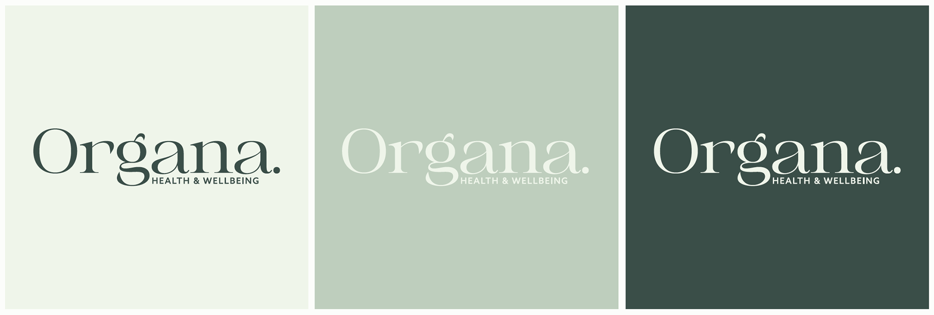
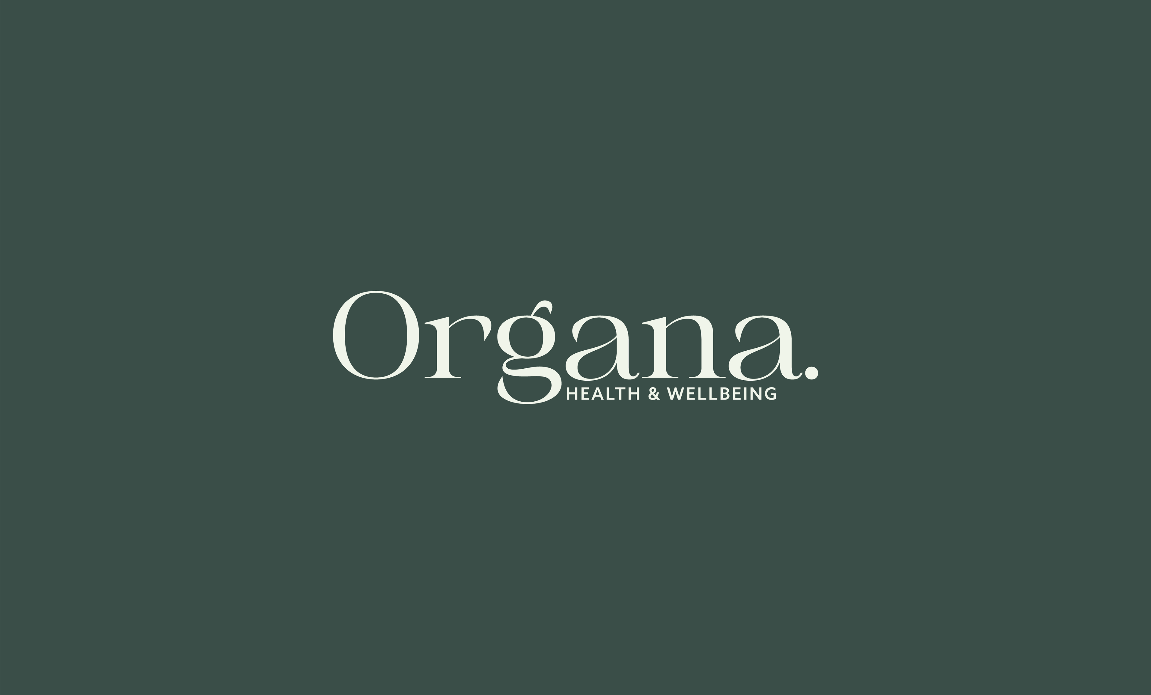
The visual identity of Organa is created using Awaken serif font and Azo sans-serif. The green colour palette has connotations of Organa’s sustainable values and is a typically gender neutral colour.
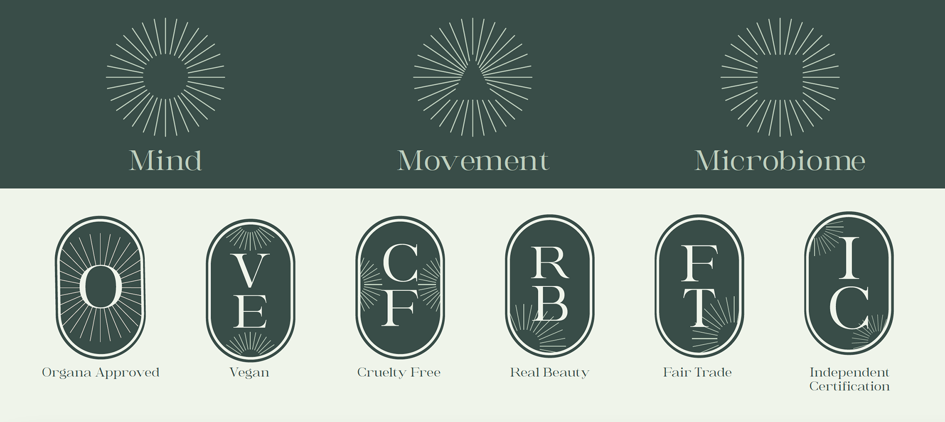
Using recognisable symbols across the Organa branding helps to create a strong and distinctive system across the whole brand. The sun-like symbols represent growth and new life.
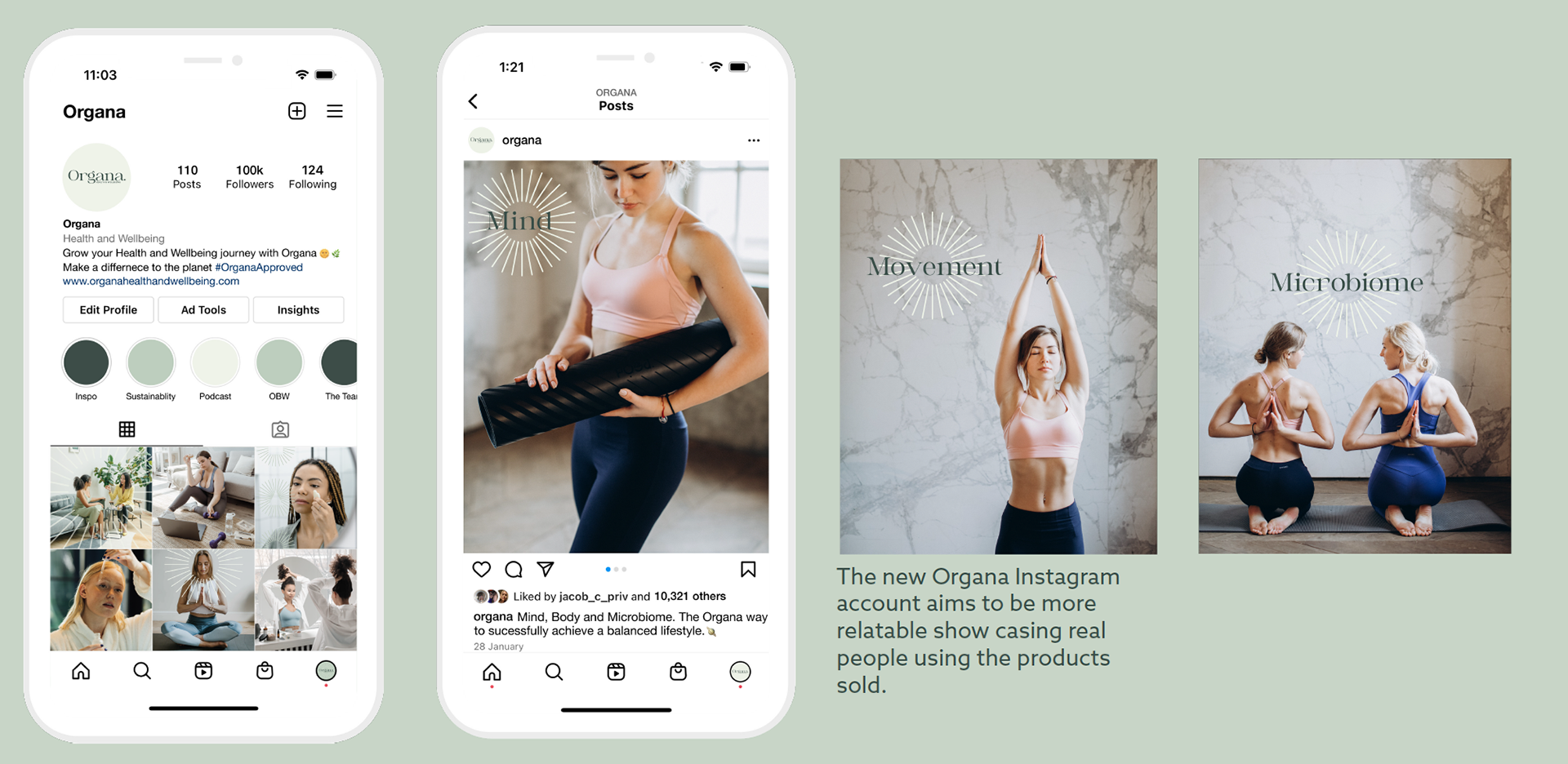
Using Instagram to promote products sold on Organa's website with shopping links encourages interaction between the two platforms and promotes the brand to a broader audience.
A key part of this re-brand is the website. As the main home of the company, where all transactions are put through, I wanted the website to be cohesive to the whole brand system. This is what the previous branding was lacking. Organa's values are something the company pride themselves on such as their Organa approved products and no go list. This is something unique to the brand, which I wanted to celebrate and highlight in this web design, making it accessible to the users.
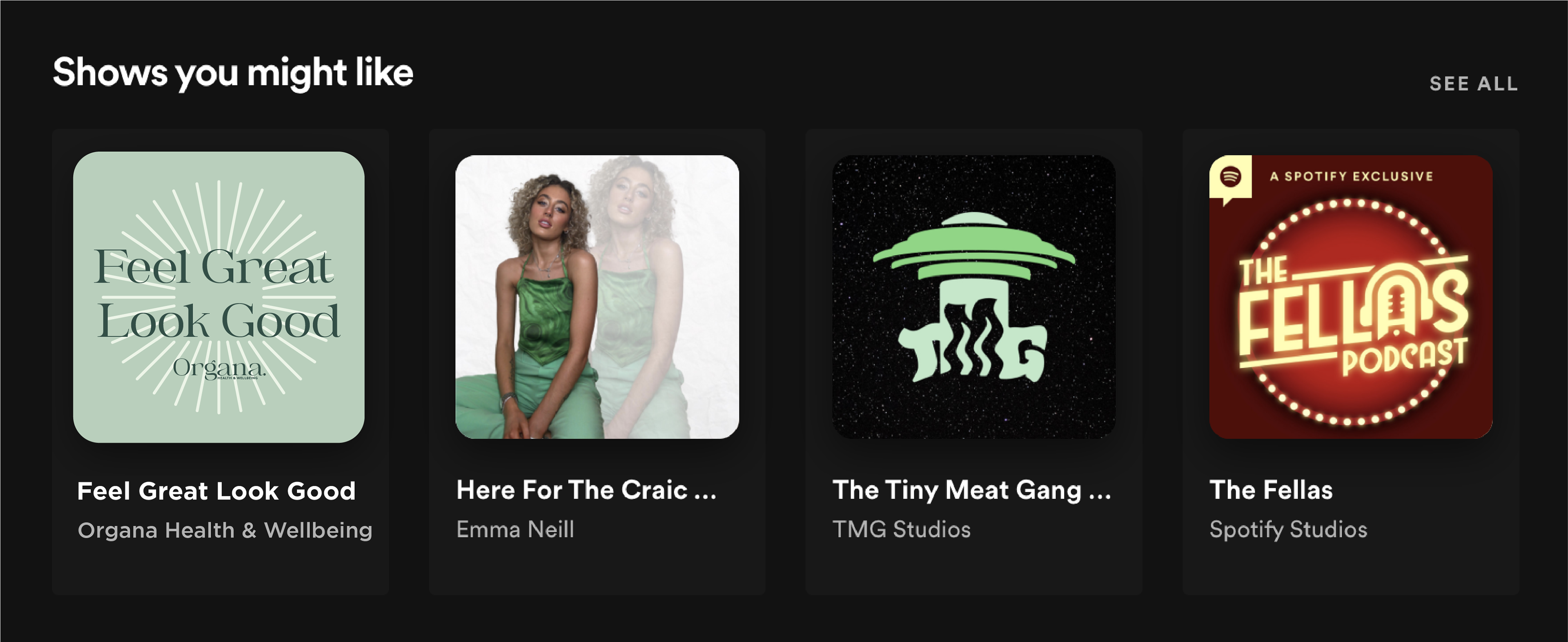
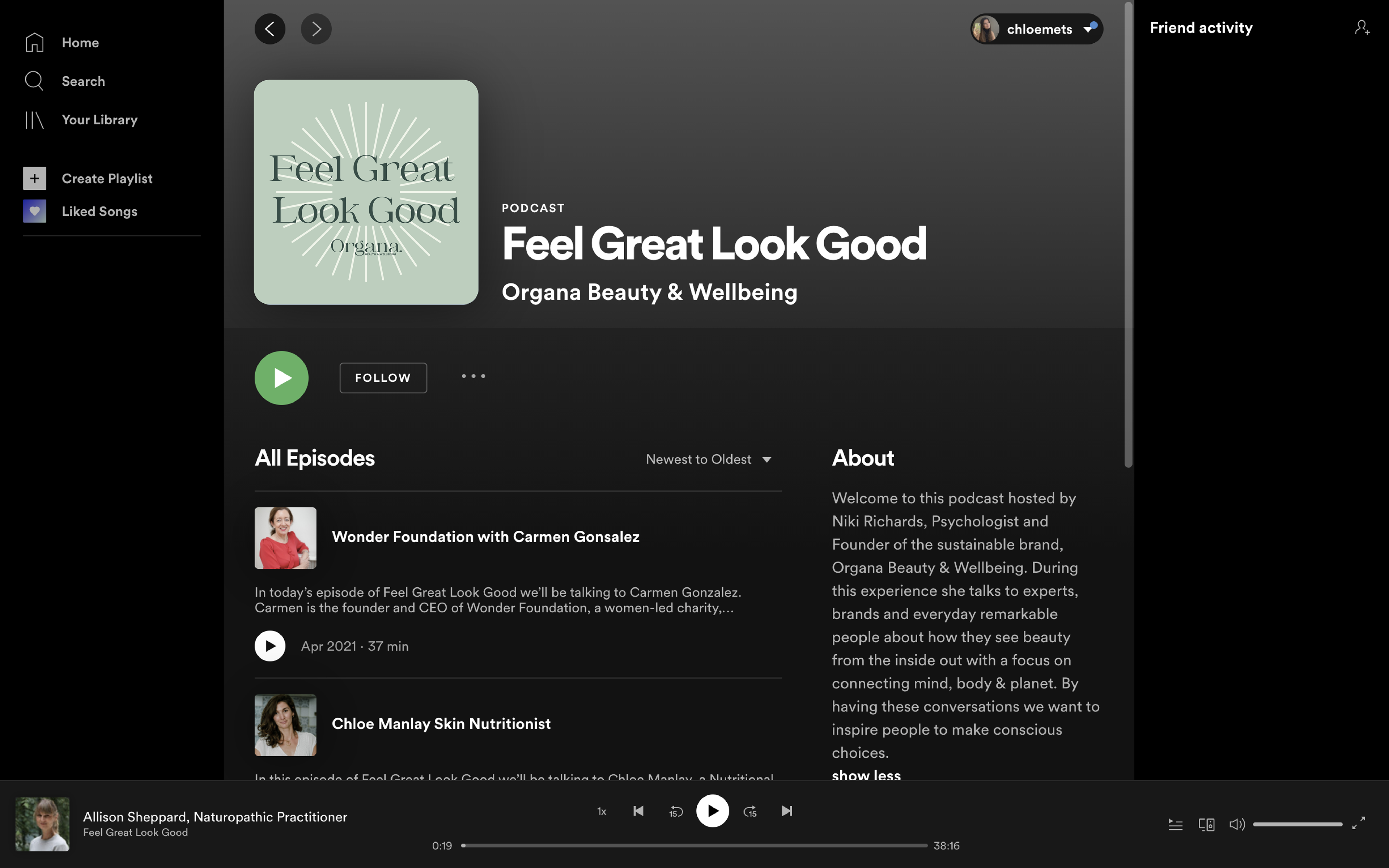
The new Spotify logo icon uses the colours and symbols seen across the Organa branding and incorporates the Organa logo into the visuals. Social media can be used to encourage awareness and engagement on the podcast by posting stories and posts when a new podcast is uploaded. As the podcast grows it could potentially have its own account.
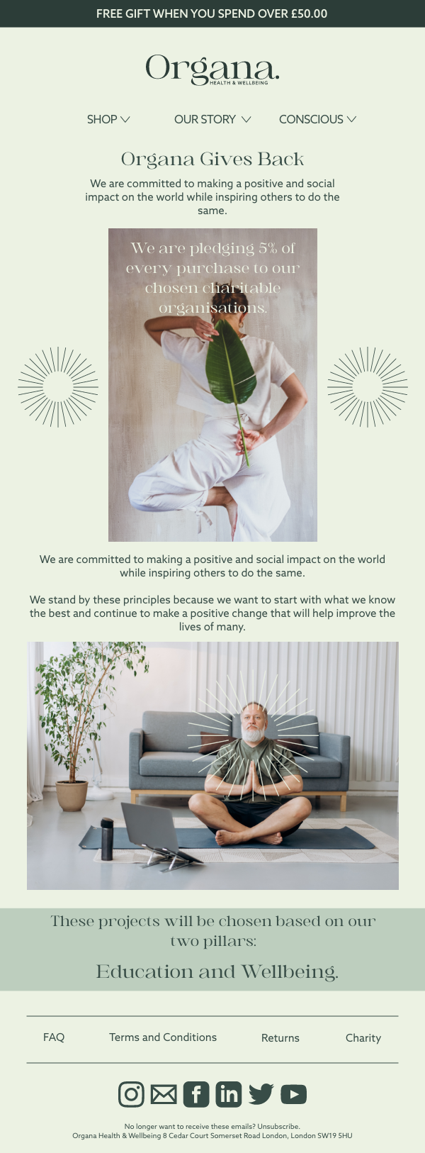
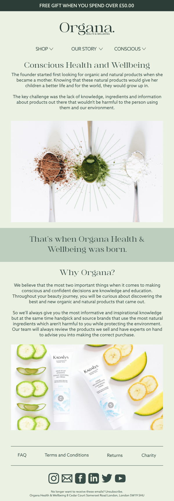
The new design for the email newsletter subscription includes more colours and images using the Organa visual language and system. Including real products and people, gives a more human feel to the brand.
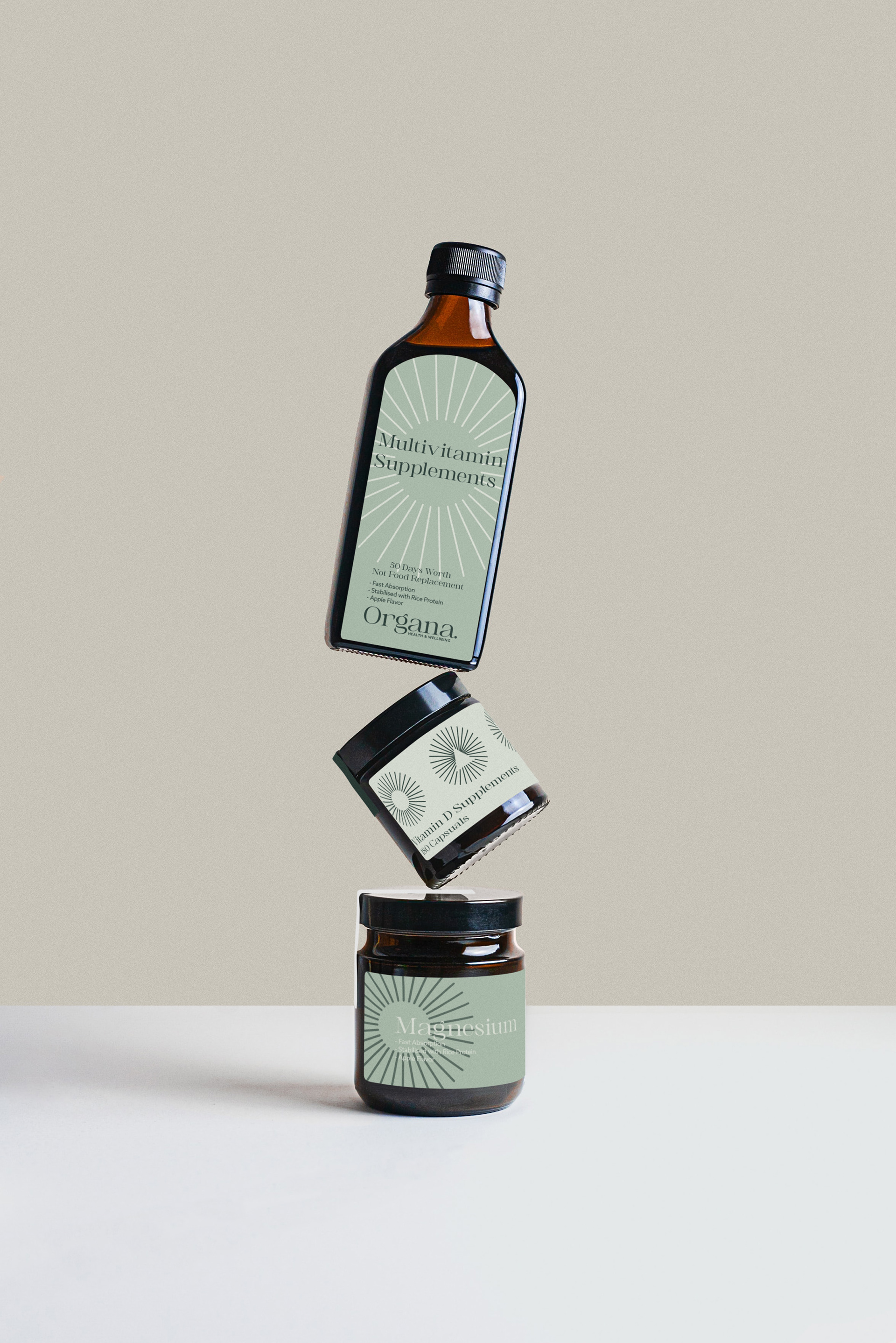
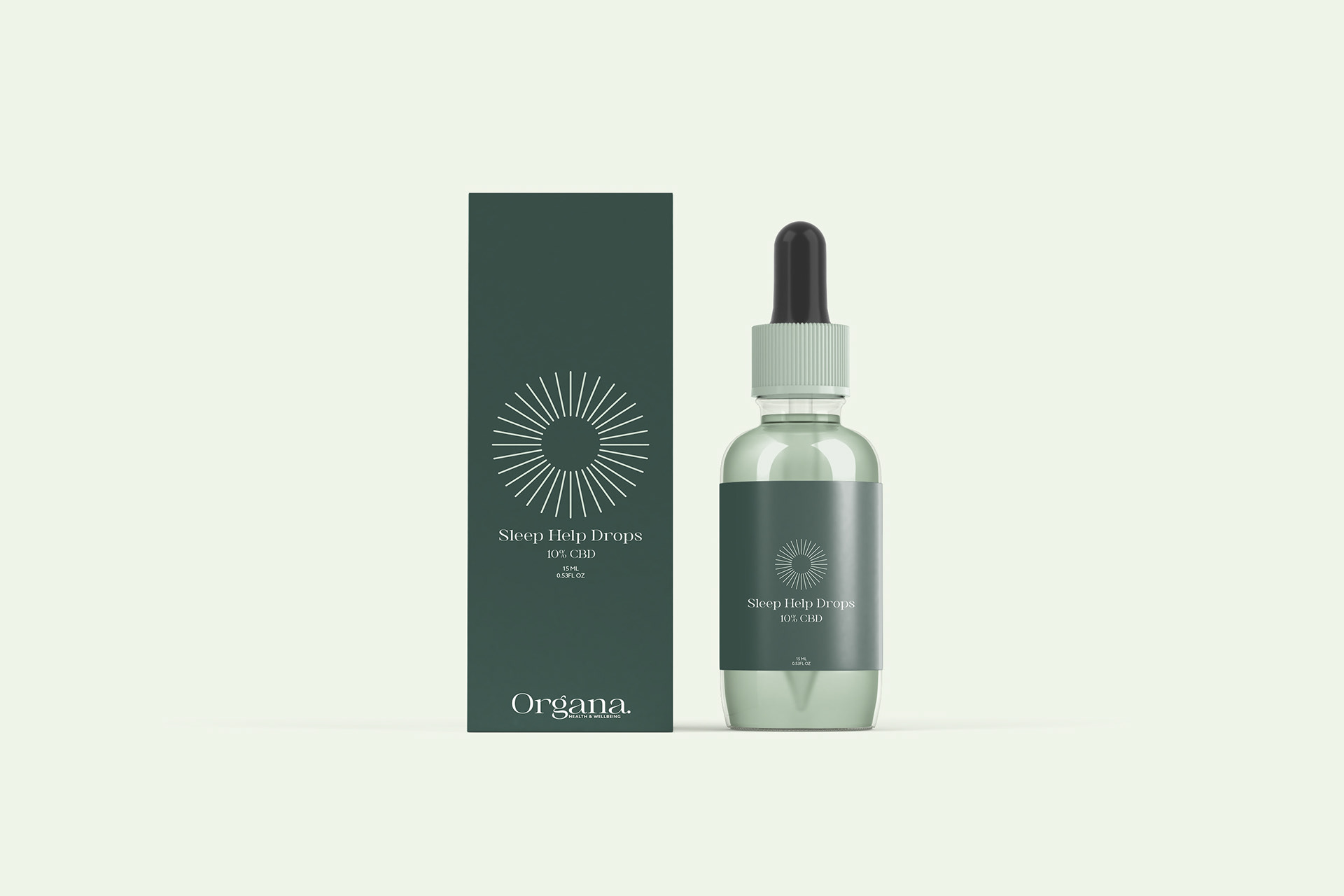
Looking towards the future these two mock-ups show how the new Organa re-brand can be used on new own brand products that might be launched in the future.